Managing Charts
Note: This feature is available in Lite, Enterprise, Ultimate and Team editions only.
Table of contents
The default grid view of query results may look unremarkable. Use DBeaver's Charts feature to transform your SELECT
queries into colorized charts. You can visualize data in Bar, Line, or Pie formats.
Create a chart directly in the SQL Editor, Data Editor or Grouping Panel. It's a quick and simple way to bring your data to life.
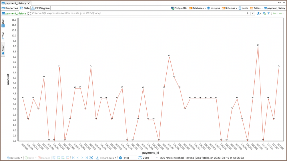
Creating Charts In SQL Editor
Visualizing large data sets makes your analysis faster and more precise. Charts let you grasp important details quickly.
To create a chart in the SQL Editor, click the Charts button ![]() on the left
vertical toolbar of the query results area. Your data instantly transforms into a visual representation.
on the left
vertical toolbar of the query results area. Your data instantly transforms into a visual representation.

Creating Charts In Data Editor
Charts are a powerful tool for visualizing structured analytical data, such as those stored in Views.
If you want to create a chart for a table, it requires some preparation. First, sort and apply various filters to the table's columns to structure the data. These changes directly affect the appearance of the chart, enabling you to customize the visual representation to fit your needs.
To build a chart using the Data Editor, simply press the Charts button ![]() located
in the left vertical toolbar. A chart based on your structured data will be created.
located
in the left vertical toolbar. A chart based on your structured data will be created.
Note: By default, the data for Y-axis is taken from the first column of the table containing numeric values.
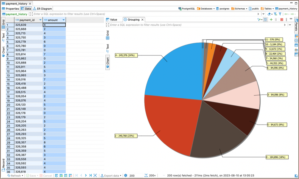
Creating Charts In Grouping Panel
The Charts feature also works with analytical tools like the Grouping Panel. When building a chart for a table that contains grouping results for one or more columns, you can easily switch the source data for the X and Y axes by changing the columns in the Charts Editor.
To create a chart in the Grouping Panel, simply press the Charts button ![]() on
the left vertical toolbar
on
the left vertical toolbar
Editing Chart Settings
To edit the chart settings, right-click inside the chart area to open the chart's context menu, and then select the Settings option. The Chart Editor will appear, allowing you to make adjustments.
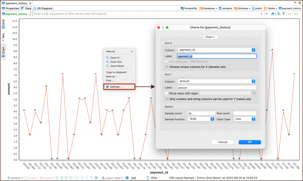
The following chart settings can be adjusted:
Setting Axis X
- In the Column drop down list of available columns select a column whose data will be used on X-axis of the bar chart. Make sure you choose unique columns for X-axis.
Define a user-friendly axis name in the Label text field.
Setting Axis Y
- In the Column drop down list of available columns, select a column whose data will be used on Y-axis of the bar
chart.
Note, that only numeric and string columns can be used for Y-axis. - Define a user-friendly axis name in the Label text field.
For advanced customization, you can use the Parse value with regex option. Regular expressions (regex) allow you to filter, match, or manipulate the column values according to specific patterns or criteria. This functionality offers precise control over the data displayed on the Y-axis, enabling you to create more refined visual representations. If you're unfamiliar with regular expressions, the Regular Expressions Tutorial provides comprehensive guidance and examples.
Setting Other Options
You can also set the following chart options:
- Sample count - maximum number of columns used for building a chart.
- Row count - maximum number of rows used for building a chart.
- Chart Type - you can choose how the data will be visualized in Bar, Line, or Pie formats.
- Sample function - an aggregate function where the values of multiple rows are grouped together to form a single summary value displayed on Y-axis.
The following sample functions are supported:
| Name | Description |
|---|---|
| AVG | Average value |
| SUM | The sum of all values |
| FIRST | The first value |
| LAST | The last value |
| COUNT | Total count of all values |
| MIN | The minimum value |
| MAX | The maximum value |
Copying to clipboard
You can copy a chart to a clipboard by selecting the Copy to clipboard option in the chart's context menu.
Exporting Charts
You can export а chart into PNG format by selecting the Save as... option in the chart's context menu.
Printing Charts
You can print а chart by selecting the Print... option in the chart's context menu.
Zooming and Viewing Options
In the chart's context menu, you will find additional options for interacting with the chart:
- Zoom in: Enlarge the view of the chart.
- Zoom out: Reduce the view of the chart.
- Zoom Reset: Return to the default zoom level.
- View as: Change the visualization format of the chart. A submenu will appear, allowing you to select between Bar, Line, or Pie formats.