DBeaver supports a large number of databases with different purposes. Relational databases remain the most common databases our users constantly work with, and our app offers a wide range of features for working with the data stored in them. For your convenience, we have added the ability to visualize data to our PRO versions as one more way to work with data.
To create a quarterly report, you may need to illustrate the dependence of payment amounts on customers’ countries. It can be done by presenting table data in the form of a bar chart while working in the Data Editor.
Please note that all loaded table rows will be visualized. Therefore, beforehand, please make sure that the fetch size matches what you need. If it turns out to be too large, the chart may not be very informative, and it may take a long time to load. To change the number of rows loaded from the database, you can use a special field in the bottom toolbar of the Data Editor.
To get a chart of the final amount of payments depending on the customer’s country, simply click on the Chart tab on the left side of the editor.
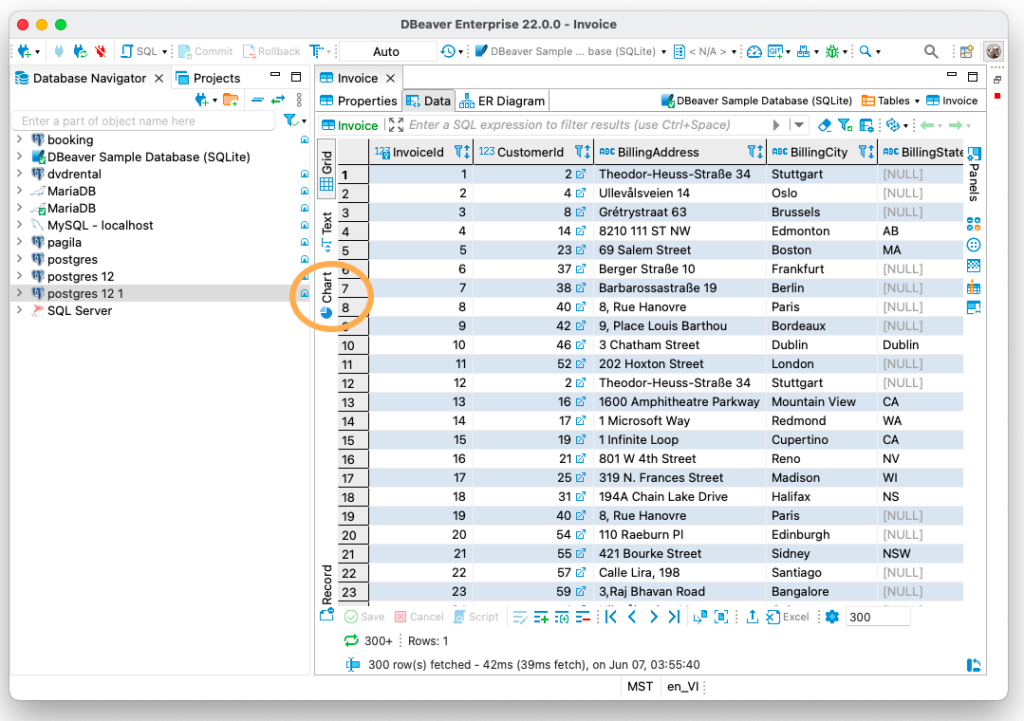
Table columns for the x-axis and y-axis are always selected automatically, but you can easily change them to another. This can be useful if you need to visualize the ratio of particular columns in your table. In our case, we need to select Total and BillingCountry columns. Right-click on the chart and go to Settings. In a window that opens you can set columns for the x-axis and y-axis and change the default labels to custom-made ones.
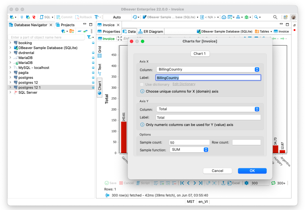
If you want to create a chart for a particular number of columns, you can change the sample count and with the drop-down list you can change the sample function. The SUM function is selected by default, and it is suitable for our case. On the chart, you can see the sums of all payments for each country. But if you need to display the maximum payment sizes for each country on the chart, you need to select the MAX function, and so on.
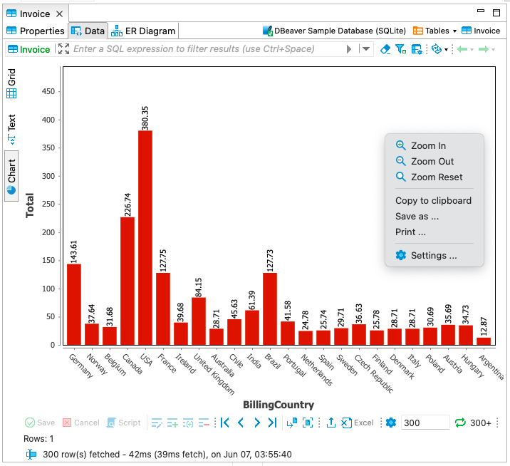
Using the context menu, you can copy a finished chart, save it as an image or print it to and add it to your report.
In one of our previous articles, we talked about how charts work in the grouping panel. In the data editor, this feature works in a more general way, but can also be useful if you need to quickly create a simple chart to evaluate the dependence of data in one column on another.
Time Series Database
Not all databases can visualize table data in chart forms. For example, time-series databases are highly specialized and work differently. Let’s talk about what data visualization options DBeaver provides for them.
A time-series database (TSDB) is a computer system that is designed to store and retrieve data records that are part of a “time series”. Time-series data is a sequence of data points collected over time intervals, giving us the ability to track changes over time. The tables of such databases usually contain only 2-3 columns, and they are usually used for collecting data over a large time period.
Data in such tables is not added by people, it is done automatically. For example, to monitor changes in depth of water in a pond, a special sensor is placed in it, transmitting the necessary information at certain time intervals.
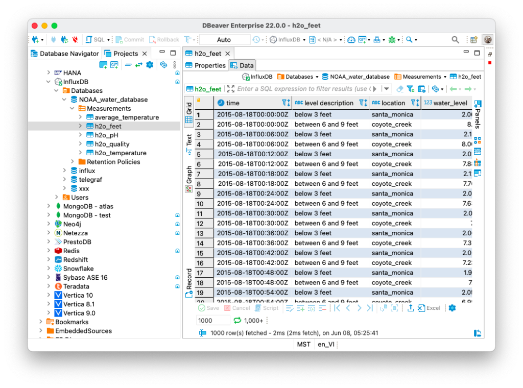
One of the most widely used time-series databases is InfluxDB. DBeaver is not only one of the very few tools that support this database, but it also allows you to visualize data from InfluxDB tables. Let’s see how it works.
Opening the table, you will see that the depth in two reservoirs is measured every 6 minutes.
Just looking at this data, you will not be able to see any dependencies or draw any conclusions. But you can go to the Graph tab and see a graph of water depth changes over a long period of time. Thanks to this graph, you can quickly evaluate the change in the parameter you are interested in over time.
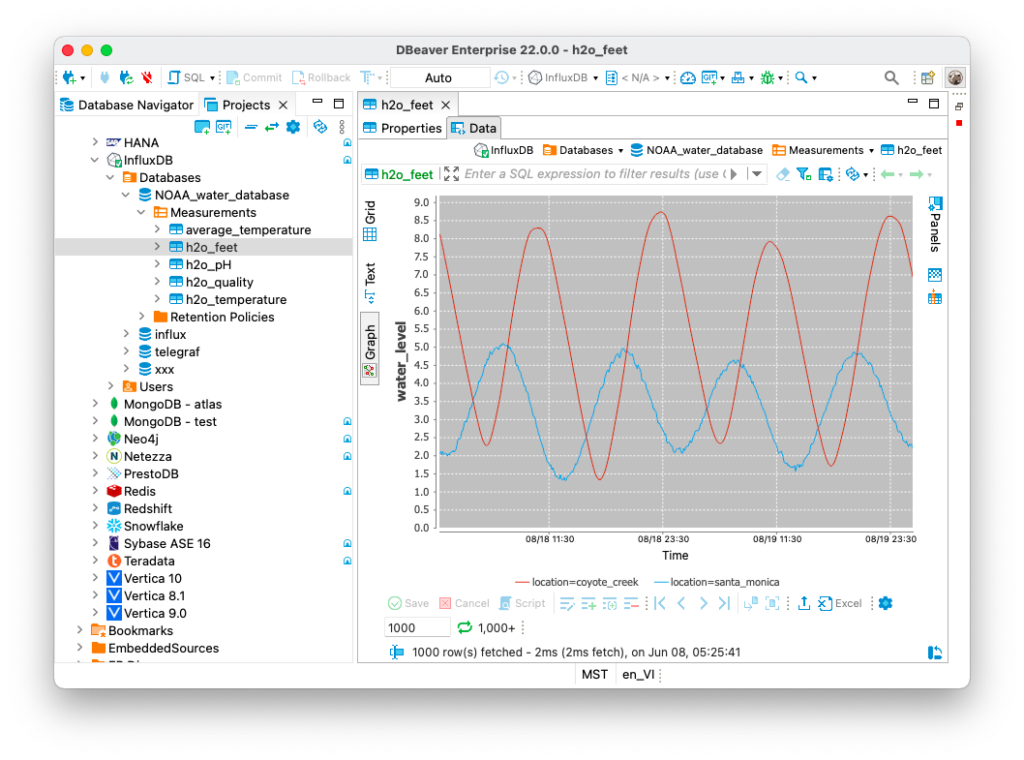
By right-clicking on this graph, you can copy it, save it as an image or print it.
Data visualization greatly simplifies the perception by a person. And since DBeaver allows you to quickly create simple charts and graphs, in many cases you do not need to export data to third-party services.