Managing charts
Note
This feature is available in Enterprise and AWS editions only.
The default grid view of query results may look unremarkable. Use CloudBeaver's Charts feature to quickly explore patterns and trends without exporting data. You can visualize data in Bar, Line, Pie, or Area formats.
Creating Charts in the SQL Editor
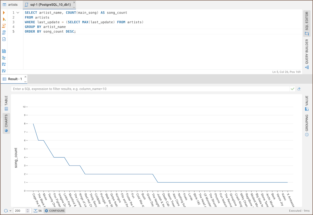
To create a chart in the SQL Editor:
- Run your query.
- Click the Charts button (
 ) on the left toolbar in the result area.
 - Your data will appear as a chart.
Creating Charts in the Data Editor
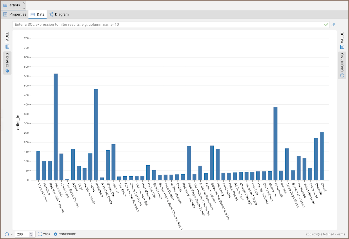
To visualize data from Data Editor:
- (Optional) Sort and filter your data using the filters.
- Click the Charts button (
 ) in the Data Editor's left toolbar.
 - Your data will appear as a chart.
Note
By default, the data for Y-axis is taken from the first column of the table containing numeric values.
Creating Charts in the Grouping Panel
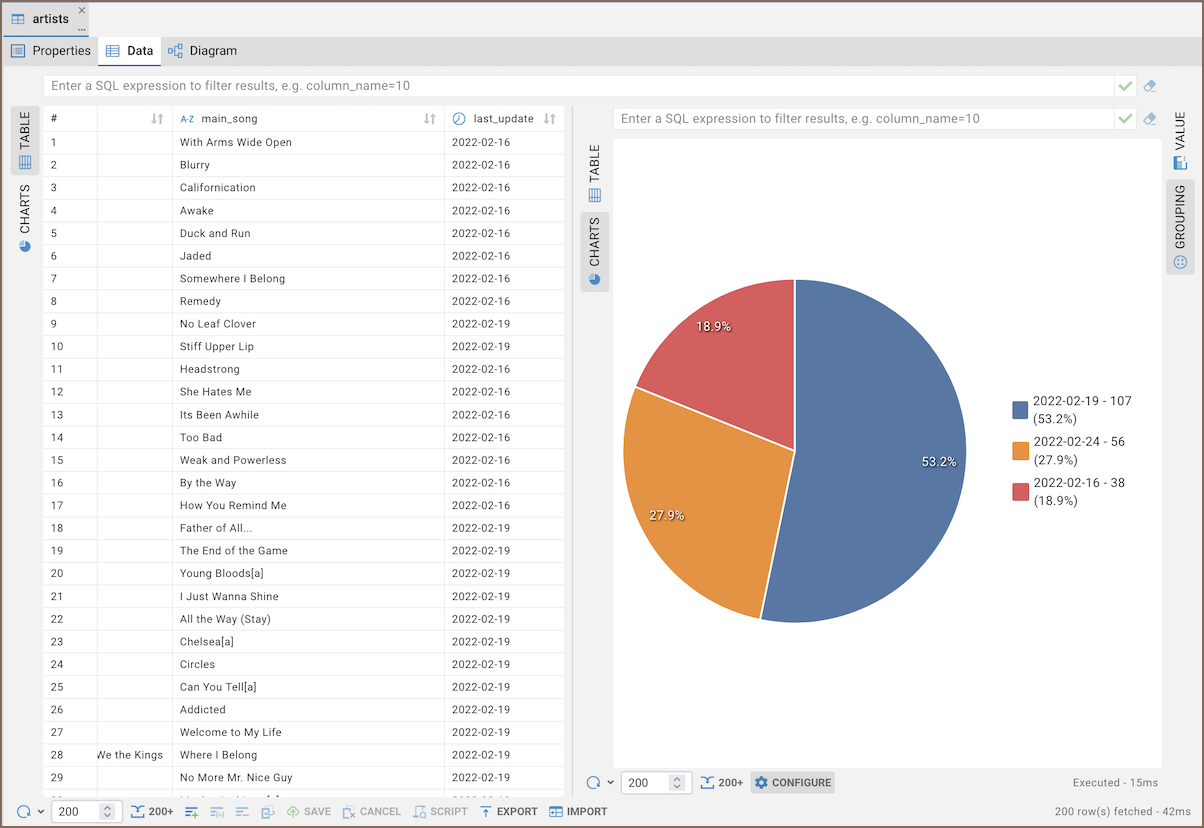
To create charts from grouped data:
- Group your data in the Grouping Panel.
- Click the Charts button (
 ).
). - Your data will appear as a chart.
Editing chart settings
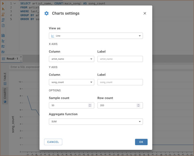
To edit your chart:
- Click the Configure button in the bottom menu.
- Adjust settings in the dialog box that appears.
Setting Axis X
- from the Field dropdown, select a column for the X-axis
- name the X-axis in the Axis title field
- optionally, use Breakdown by to group results by another column
Setting Axis Y
- choose a column for the Y-axis from the Field dropdown
- select an Operation to define how values are aggregated (e.g.,
SUM,AVG,COUNT,MIN,MAX,FIRST,LAST) - label the Y-axis in the Axis title field
- click + Add measure to include additional measures
Using Breakdown by
The Breakdown by option lets you split the chart into multiple series based on the selected column. For example, if
you choose last_name, the chart will display a separate line or area for each unique last name.
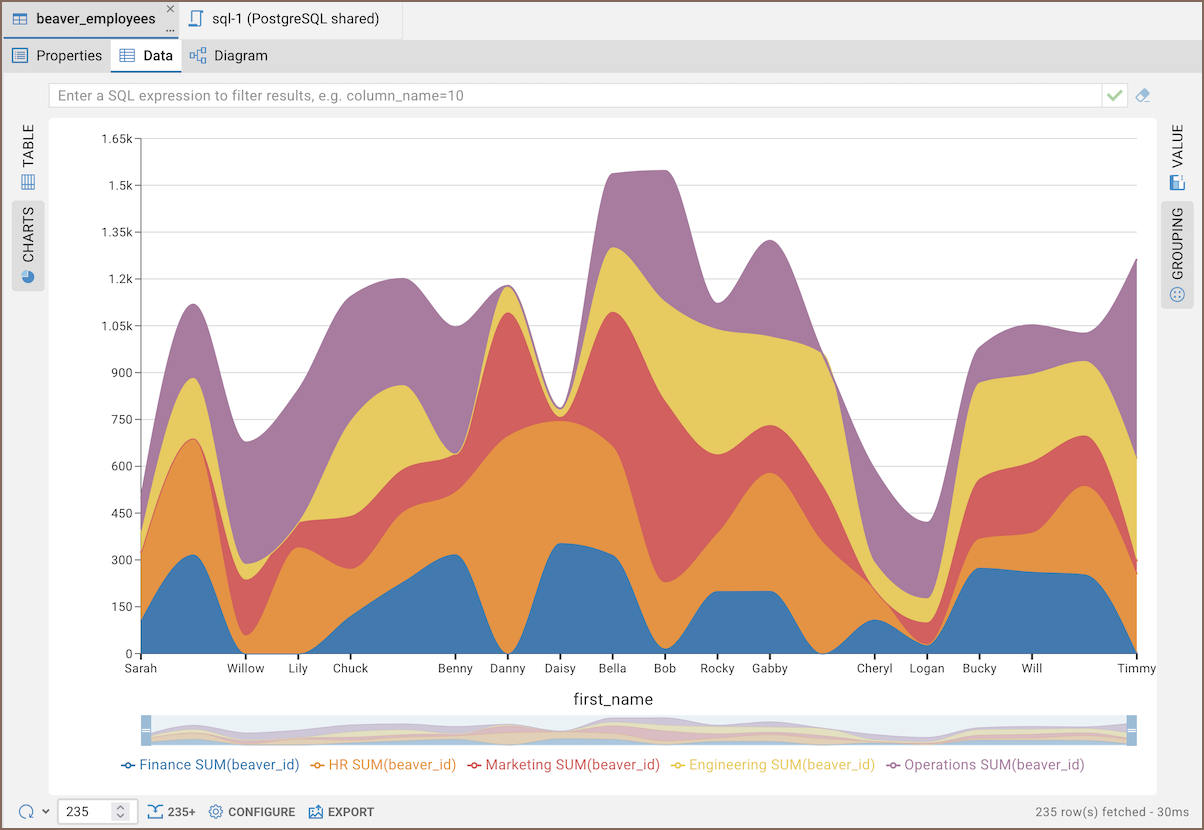
When you hover over the chart, a tooltip appears showing values for each series in that point.
Note
The Breakdown by option isn’t available for Pie charts.
Adjust visible data range
Use the slider below the chart to control which part of the data is displayed. Drag the handles on both sides to zoom in or out on a specific data range.

Tip
This is useful when working with large datasets – you can focus on a smaller section without reloading or filtering data.
Setting other options
You can also set the following chart options:
| Setting | Description |
|---|---|
| Chart type | Select visualization type: Bar, Pie, Line, or Area |
| Field | Choose a column for the X or Y axis |
| Axis title | Enter a custom label for the axis |
| Breakdown by | Group data by an additional column (creates separate series for each value; not available for Pie charts) |
| Operation | Select a function for data aggregation on the Y axis |
AVG - Calculates the average of the values |
|
SUM - Sums up all the values |
|
FIRST - Displays the first value |
|
LAST - Shows the last value |
|
COUNT - Counts all the values |
|
MIN - Finds the minimum value |
|
MAX - Identifies the maximum value |
|
| Add measure | Add another Y-axis field to display multiple measures on one chart |
| Add stack group | Combine selected measures into a single stacked group. Each group appears as one stacked bar or area segment. |
| Row count | Limit the number of rows to include in the chart |
| Show values on chart | Display numeric values directly on the chart bars or points |
Export chart image
You can export your chart as an image file.
- In the Charts window, click Export button (
 )
) - In the Export image dialog, enter a name for your file
- Choose a File format (SVG or PNG)
- (Optional) Enable Transparent background if you don’t want a white background
- Click Export to download the image

